

I use JBzoo make to filter in website, but item and picture not work responsive in mobile screen.
I am using joomla 2.5.22 and Zoo 3.1.6
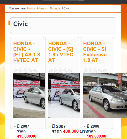
Page problem : http://bizautocenter.../category/civic
thank you for your support

 Тема закрыта
Отправлено 29 July 2014 - 11:27
I use JBzoo make to filter in website, but item and picture not work responsive in mobile screen.
I am using joomla 2.5.22 and Zoo 3.1.6
Page problem : http://bizautocenter.../category/civic
thank you for your support
Отправлено 30 July 2014 - 12:17
Hello,
I see that you already managed to fix the issue with images, but still there are some possible improvements.
I think that it will be better to arrange items in one column when the screen is small, not three like it is now. But to do this we will need to make a small changes to the JBZoo template, because there is <div class="clear clr"></div> after every three items, and I think it is better to remove it if you need responsiveness.
So, go to
media/zoo/applications/jbuniversal/templates/catalog/renderer/item_columns
and make a copy of _default.php file. Rename it the same as your application alias ( in your example it should be jbzoo.php). Then just comment one line in this part:
if ($isLast) {
    echo '<div class="clear clr"></div>';
}
so it will be like this:
if ($isLast) {
//  echo '<div class="clear clr"></div>';
}
Now there will be no clearing divs within your products so it ill be easier to add some responsiveness.
After that use CSS media queries to make different styles for the wide screens and for small ones.
For example, there is a rule now:
.jbzoo .width33 {
    width: 32%;
    float: left;
}
which could be changed to
.jbzoo .width33 {
    width: 100%;
    float: none;
}
when the screen is small. And so on.


Community Forum Software by IP.Board
Лицензия зарегистрирована на: JBZoo Support Forum

